We use cookies to offer you the best service possible. You can read more about our cookie policy here: Cookie Policy. By continuing to use the site, you accept have agreed to accept these cookies. Dismiss
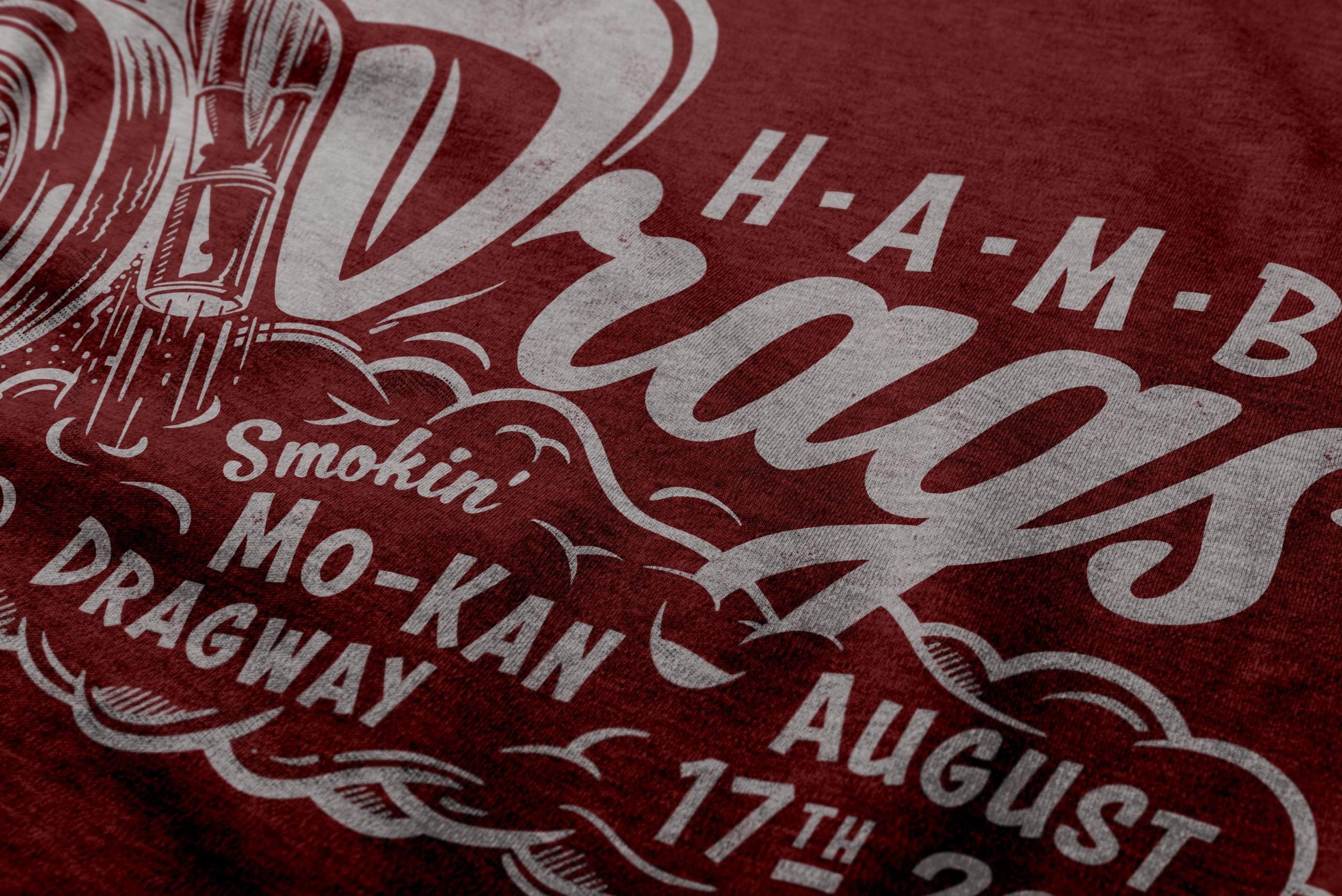
The 17th annual H.A.M.B. Drags needed a logo that carried the whole event in one hit: the edition, the name, the venue and the date. It had to look like it belonged at the strip, not on a sports-drink can. So I started where every drag run starts, at the back wheel.
Reference
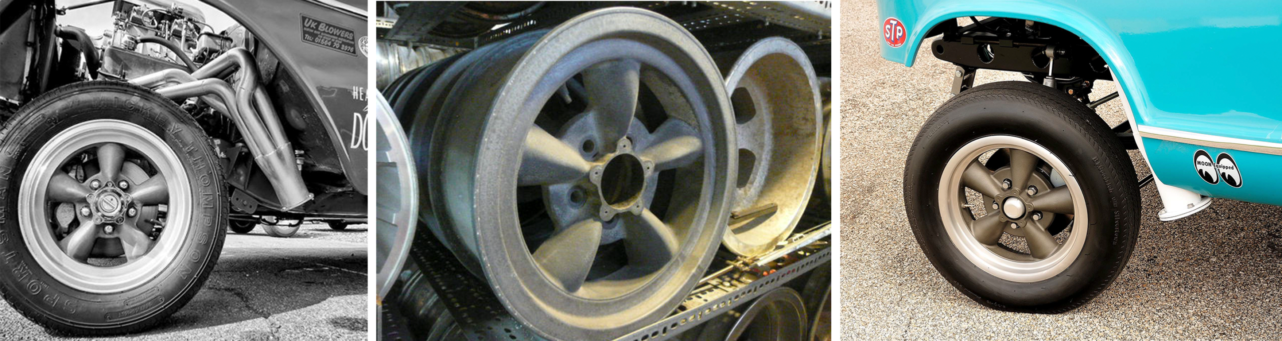
Before drawing anything I went looking at real iron. Gassers; Five-spoke mags, fat rear rubber, sidewalls with some weight to them. The wheel was going to be the hero of the logo, so it had to look right to people who know what a proper mag looks like.
Thumbnail Sketches
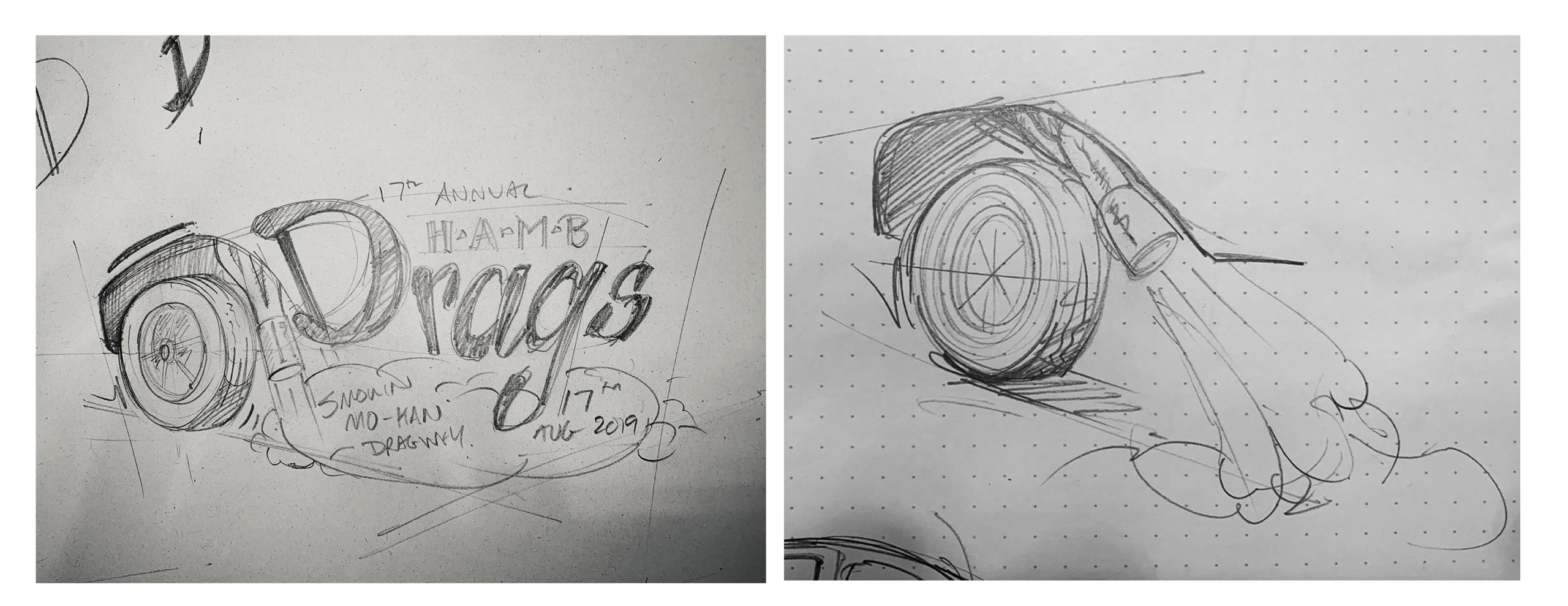
Then quick pencil roughs to find the shot. On the right, I’m working out the wheel, the arch over it and where the pipe points. A low three-quarter view won because the tyre looks heavy and planted, and it throws the smoke forward, right where the type wants to sit.
On the left, the first go at a full lockup. The wheel arch rolls straight into the D of “Drags”, and the venue and date drop into the burnout smoke. That rough became the plan for everything after it.
Layout
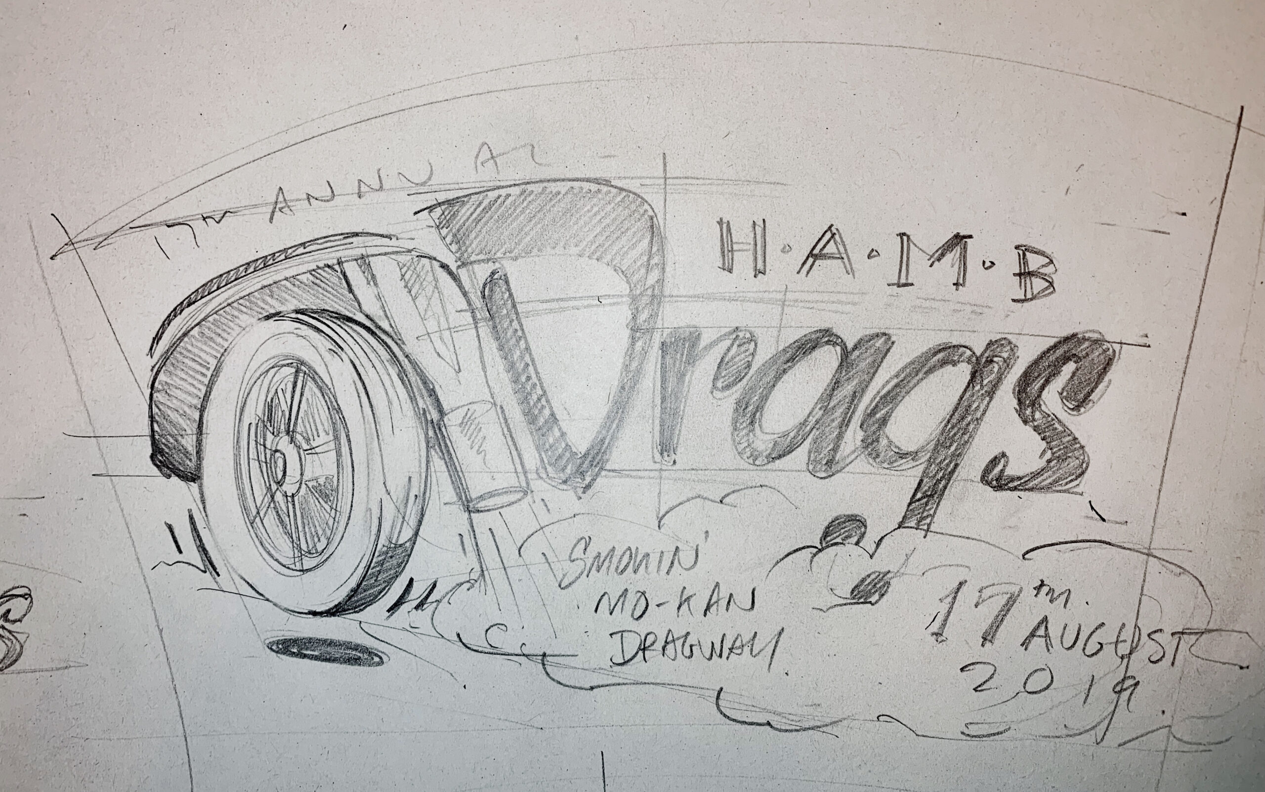
Next, the rough got tightened up. The curve of the arch now sets the bowl of the D, so the car and the word read as one shape. “17th Annual” arcs over the top, H·A·M·B sits above “rags”, and the smoke cloud grows to hold “Smokin’ Mo-Kan Dragway” and the date.
Layout
With the layout locked, everything got redrawn clean at full print size. The wheel got proper spokes, there are speed lines around the tyre, and the zoomie pipe gets its flared tip.
The smoke picked up hatched shading, and the lettering turned into a confident brush script with a heavy D up front.
Final
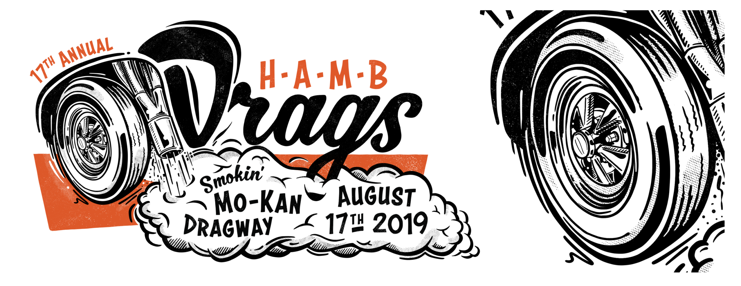
Last came a worn, textured pass and a block of orange behind the wheel, so the mark looks like it’s been through a few print runs.
The clean version stays as the master for when a sharp print suits better.